


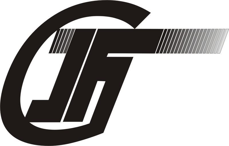
IFG Logo

-
Grumpy
- Old Timer

- Posts: 2653
- Joined: Sat Jun 03, 2006 12:43 am
- Location: UK
Re: IFG Logo
That`s strange, I thought it looked like `GJF`............ `Gindians Jor Funs` ?
-
kanwar76
- Eminent IFG'an

- Posts: 1865
- Joined: Tue Jun 06, 2006 7:00 pm
- Location: Bang-a-lure
- Contact:
Re: IFG Logo
No offense to anyone but it looks like logo of some cement company 
-Inder
-Inder
I am the Saint the Soldier that walks in Peace. I am the Humble dust of your feet, But dont think my Spirituality makes me weak. The Heavens will roar if my Kirpan were to speak...
-
sudhakardm

- On the way to nirvana

- Posts: 67
- Joined: Fri Oct 06, 2006 10:11 pm
- Location: Mysore
Re: IFG Logo
Hi
Logo covers most of the alphabets in your name
sudhakar
Logo covers most of the alphabets in your name
sudhakar
-
snIPer

- Veteran

- Posts: 1661
- Joined: Wed May 23, 2007 12:06 pm
-
Abhilash Nagalingaiah
- Learning the ropes

- Posts: 17
- Joined: Mon Jun 04, 2007 1:35 pm
Re: IFG Logo
no one would suddenly recognise this as an IFG logo .....not to be mean
-
jonahpach

- Shooting true

- Posts: 872
- Joined: Tue May 23, 2006 10:25 pm
- Location: Aizawl
- Contact:
Re: IFG Logo
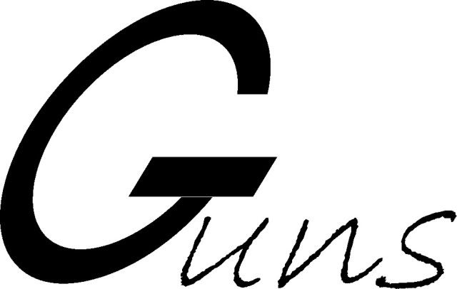
Boy what a bunch of hard nuts we have here.. Here's another (feeble) attempt to please u guys..
How about this then huh??
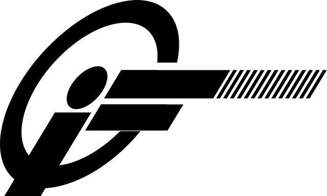
And for those amongst us who find themselves lacking in imagination and are creativity impaired here is a simple graphic elucidation of the logo and its design concept.
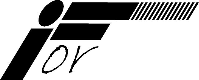
The letter i(indians)F(or) depicts a shooter in an Olympic shooting stance
The letter G also incorporates a target bulls eye (Clever eh!)

How about this then huh??
And for those amongst us who find themselves lacking in imagination and are creativity impaired
The letter i(indians)F(or) depicts a shooter in an Olympic shooting stance
The letter G also incorporates a target bulls eye (Clever eh!)
Speak softly and carry a big gun!
-
Grumpy
- Old Timer
- Posts: 2653
- Joined: Sat Jun 03, 2006 12:43 am
- Location: UK
Re: IFG Logo
Sorry but `Gi=` does not suggest `IFG` - `Indians For Guns`.
-
HSharief
- Shooting true
- Posts: 568
- Joined: Tue May 23, 2006 6:11 pm
- Location: Misriganj
Right on Grumpy, It looks like the logo of the movie "Girl Friend"Grumpy";p="25533 wrote: Sorry but `Gi=` does not suggest `IFG` - `Indians For Guns`.
Jonah, nobody is being hard, I think just constructively critical. I think a logo should convey the message easily without having to be explained. I for one am pretty impressed at the attempts your making and the effort you're putting into it. Keep on and I'm sure you'll come up with one that will appeal to all the hard nuts.
Last edited by HSharief on Fri Aug 24, 2007 9:57 pm, edited 1 time in total.
-
Grumpy
- Old Timer
- Posts: 2653
- Joined: Sat Jun 03, 2006 12:43 am
- Location: UK
Re: IFG Logo
Yes, the graphics are very good and yes, the `I` should dominate......that and the `G` of course.....but the `I` has to lead.
I can`t help any more than that - because of being somewhat literally minded................ and "lacking in imagination and creativity impaired" apparently.
I can`t help any more than that - because of being somewhat literally minded................ and "lacking in imagination and creativity impaired" apparently.